canva feedback
by Celero 2
Celero v1
APP DESIGN REVIEW BY @Arvin
You're one step closer to releasing your app!
Your app is now at Design Review. It's all about making sure your app looks and feels like part of Canva.
Designing apps with Canva
Because we're a design platform, users (understandably) come to expect a certain level of design quality across all of Canva, including apps.
It's why every app is reviewed with our UI and UX guidelines front of mind — so we can all be confident it will integrate seamlessly into user workflows and keep them coming back, again and again.
✐ Handy design resources ✐
- 🔗 Canva Developers Portal - Learn about App SDK guidelines and instructions, technical documentation, and app submissions
- 🔗 Canva Developers Community in Discourse - Get the latest updates, community support, and take part in discussions on everything Canva Developers
- 🔗 Canva Design Principles - View high-level principles in practice during design review
- 🔗 Storybook - Test UI components with technical documentation
- 🔗 Figma UI kit - View UI components and their design documentation
Action items
Requirement levels
✦ MUST HAVE
User impact An issue that blocks the user to move forward.
Design impact Must comply with latest development guidelines, templates, design principles, and App SDK UI kit.
Release impact Blocked and must be resolved for app release.
✦ SHOULD HAVE
User impact An issue that impairs the user to have a good experience.
Design impact Should align with latest development guidelines, templates, design principles, and App SDK UI kit.
Release impact Compromised and should be resolved for app release.
✦ GOOD TO HAVE
User impact An issue that can be trivial and unnoticed by the user. An opportunity that can be explored to enhance user experience.
Design impact Align with latest development guidelines, templates, design principles, and App SDK UI kit.
Release impact Will not affect app release.
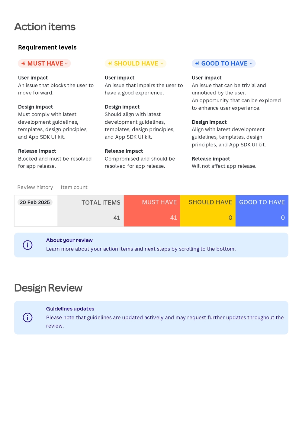
| Review history | Item count |
|---|---|
| 20 Feb 2025 | TOTAL ITEMS: 41 / MUST HAVE: 41 / SHOULD HAVE: 0 / GOOD TO HAVE: 0 |
About your review: Learn more about your action items and next steps by scrolling to the bottom.
Design Review
Guidelines updates: Please note that guidelines are updated actively and may request further updates throughout the review.
Round 1 - 20 Feb 2025
General
1 - Use sentence case
✦ MUST HAVE | ✧ COPY | ✹ PENDING
To align with our copy design guidelines, please use sentence case for all UI copy, including paragraphs, buttons, headings, and labels. Sentence case is a styling convention where only proper nouns and the first letter of the first word in a sentence is capitalised. Apply this to all pages of the app.
For example: "Biscuit the dog and his quest for treats"
Instead of: "Biscuit the Dog and His Quest for Treats"
2 - Fix go back interaction
✦ MUST HAVE | ✧ INTERACTION | ✹ PENDING
When the user clicks the back button on any subpage, it redirects them to the main page instead of the last page they visited. This can be confusing for users and creates friction when trying to return to subpages. Please adjust the back button to redirect to the previous page the user was on in the app.
Sign in page
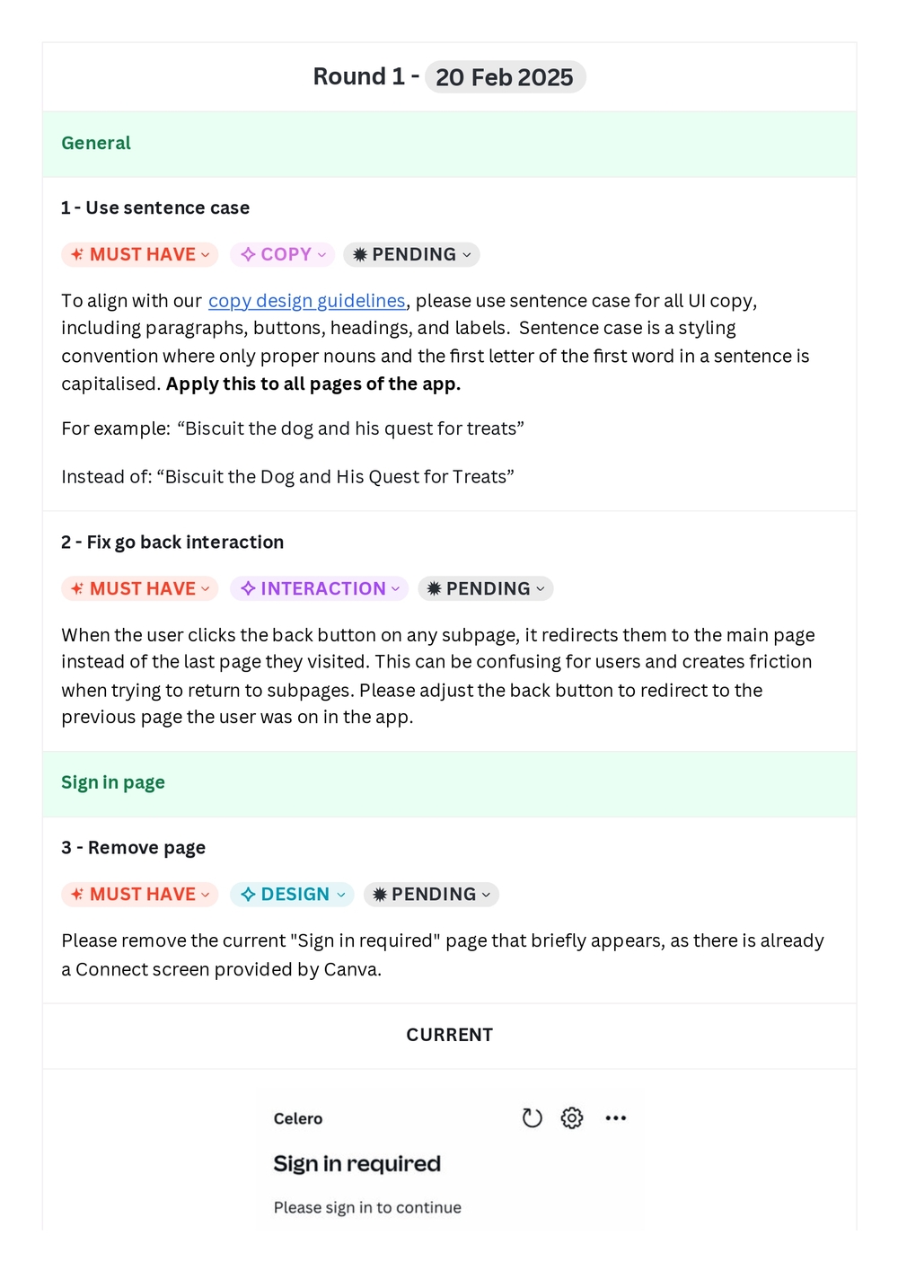
3 - Remove page
✦ MUST HAVE | ✧ DESIGN | ✹ PENDING
Please remove the current "Sign in required" page that briefly appears, as there is already a Connect screen provided by Canva.
Main screen
4 - Use our HorizontalCard
✦ MUST HAVE | ✧ DESIGN | ✹ PENDING
Please use our UI Kit components as much as possible to comply with Canva's design standards, accessibility practices, and patterns. Use our official Horizontal Card for the Microsite cards on the page.
5 - Revise button
✦ MUST HAVE | ✧ DESIGN | ✹ PENDING
Please use a stretched Secondary Button in place for "Add a new Microsite" to clarify that this is an action. Move this button to the top of the page instead of having it as part of the list of Microsites.
6 - Add description
✦ MUST HAVE | ✧ DESIGN & COPY | ✹ PENDING
Add a description (size: body-small) below the button to describe the action it will do. "Publish your designs so you can share it with your contacts"
7 - Remove back button
✦ MUST HAVE | ✧ DESIGN | ✹ PENDING
Currently, the back button of this page does nothing when clicked, which can cause confusion. Please remove the button entirely from this page.
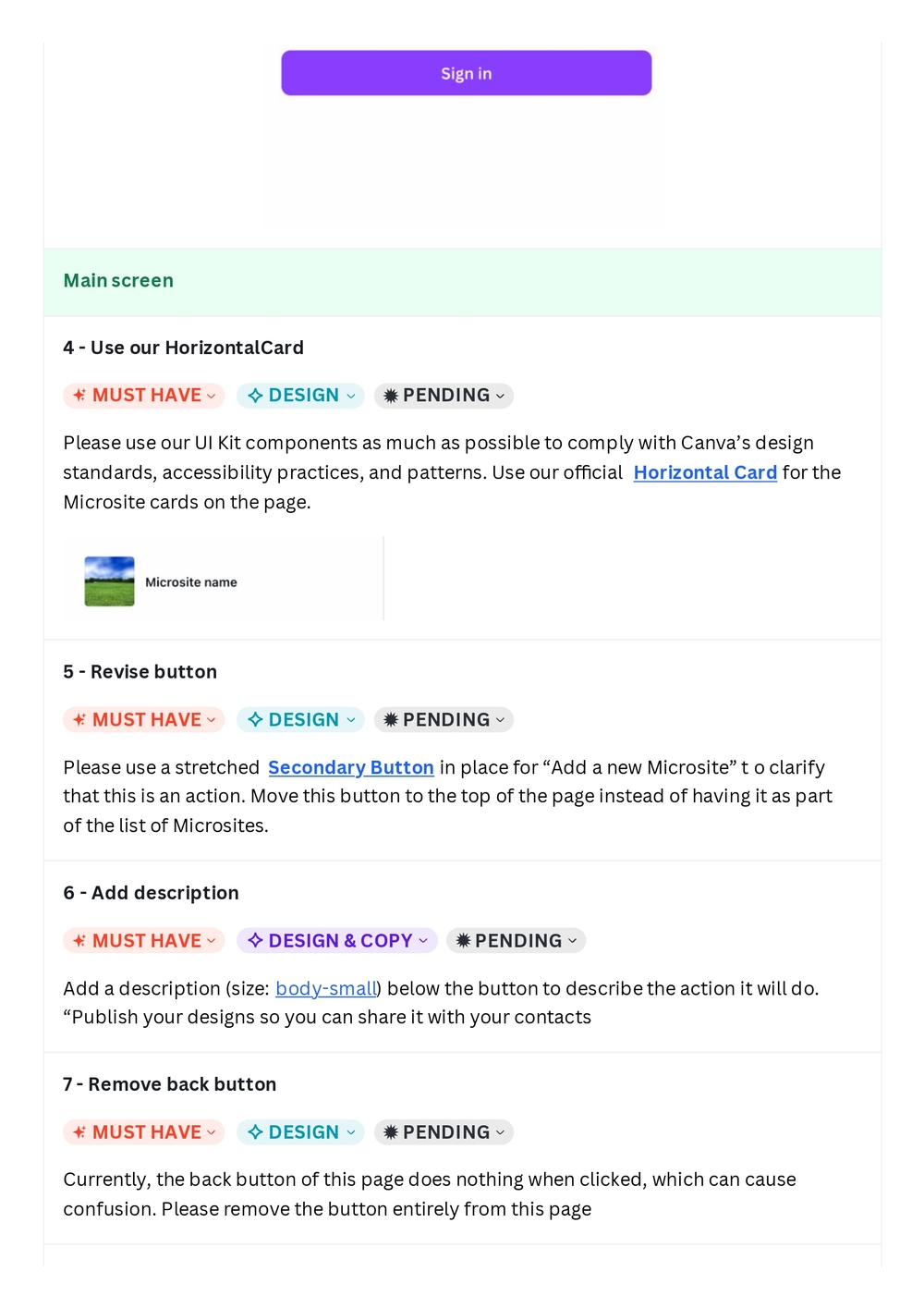
8 - Use Form Field component
✦ MUST HAVE | ✧ DESIGN | ✹ PENDING
Rather than using "Select your Microsite" as the page title on top, please use our Form Field component in our UI Kit to label the SearchInputMenu. Use the copy of "Select your Microsite" or something similar for this field.
CURRENT | EXPECTED
Search results
9 - Use placeholders
✦ MUST HAVE | ✧ DESIGN | ✹ PENDING
Please use our UI Kit components as much as possible to comply with Canva's design standards, accessibility, and patterns. When loading search results, please use Placeholders in rectangles below the search bar to pattern the Microsite cards loading.
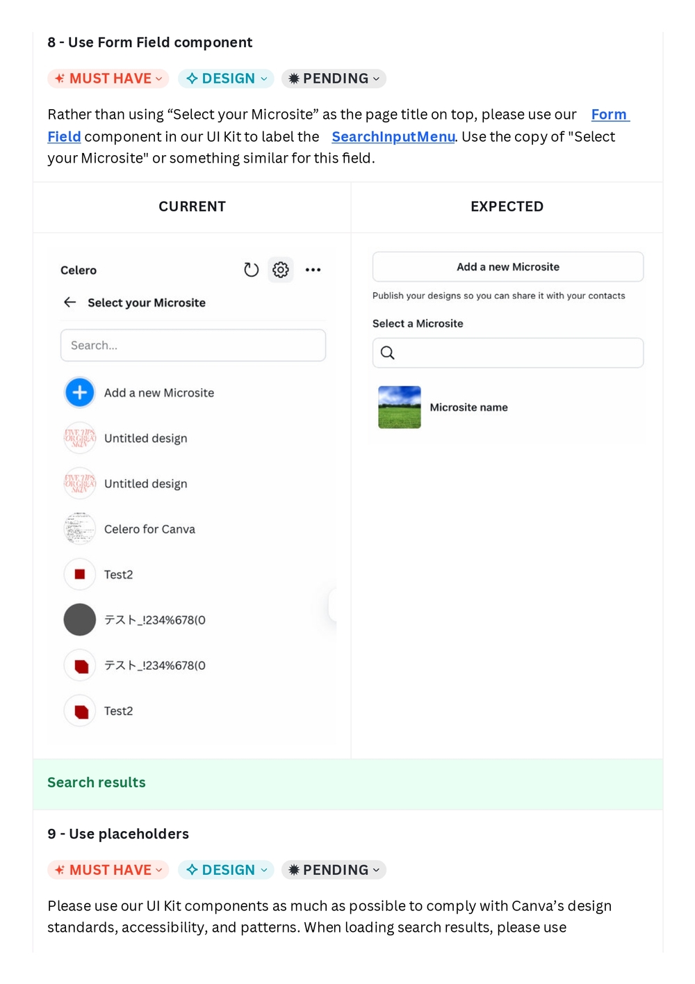
Placeholders in rectangles below the search bar to pattern the Microsite cards loading.
10 - Use empty state pattern
✦ MUST HAVE | ✧ DESIGN & COPY | ✹ PENDING
Use our official Search Results Empty State pattern found in our Storybook to align the design and copy.
"No results found for {searchTerm}. Try searching for a different term."
CURRENT
Publish your design
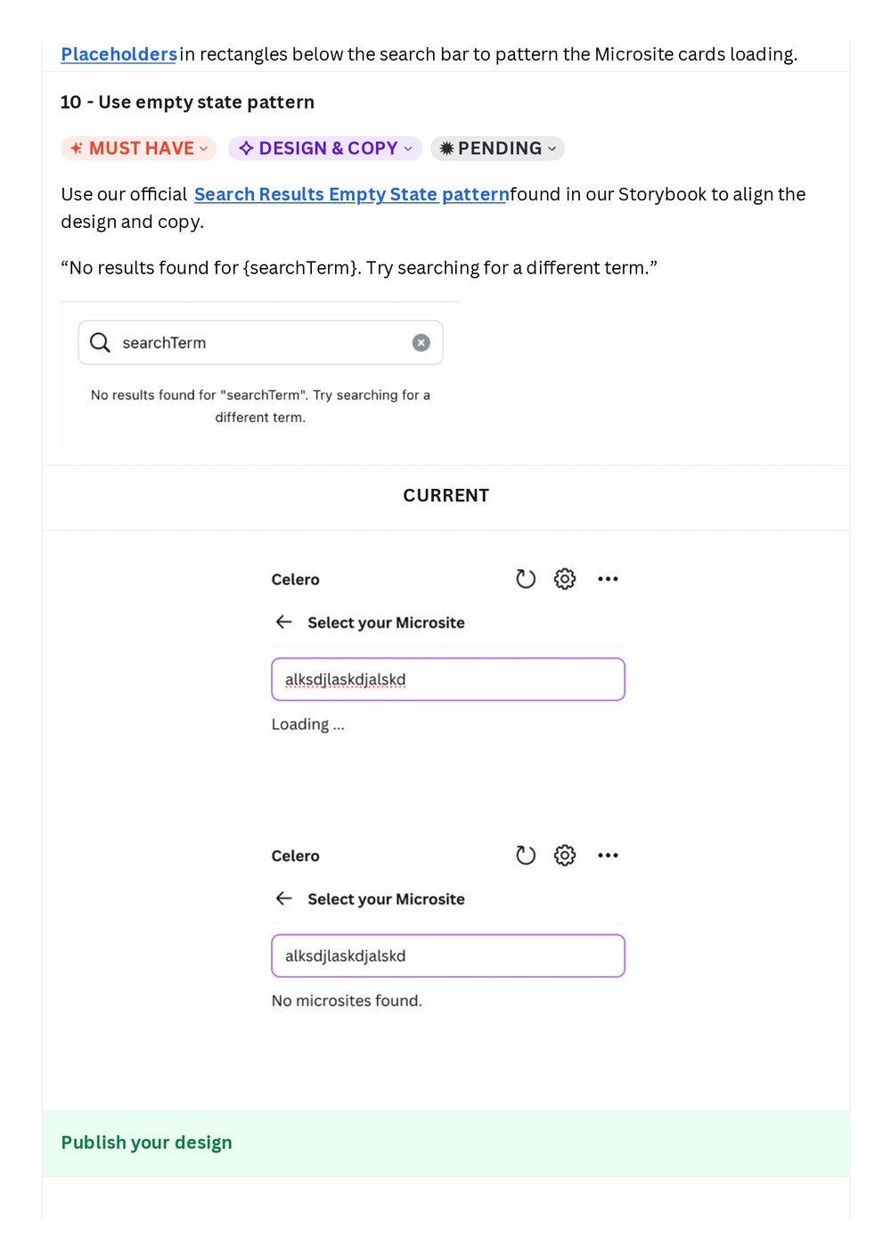
11 - Go straight to Export function
✦ MUST HAVE | ✧ DESIGN & INTERACTION | ✹ PENDING
To reduce the friction involved in adding a new Microsite, please redirect users to the Export function when they click "Add a new Microsite" on the main page, rather than sending them to another page.
CURRENT
Loading state
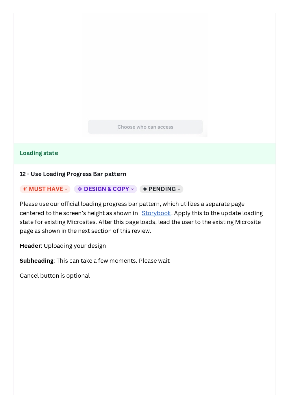
12 - Use Loading Progress Bar pattern
✦ MUST HAVE | ✧ DESIGN & COPY | ✹ PENDING
Please use our official loading progress bar pattern, which utilizes a separate page centered to the screen's height as shown in Storybook. Apply this to the update loading state for existing Microsites. After this page loads, lead the user to the existing Microsite page as shown in the next section of this review.
Header: Uploading your design
Subheading: This can take a few moments. Please wait
Cancel button is optional
CURRENT
Existing Microsite
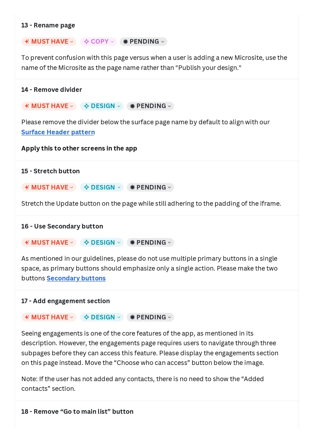
13 - Rename page
✦ MUST HAVE | ✧ COPY | ✹ PENDING
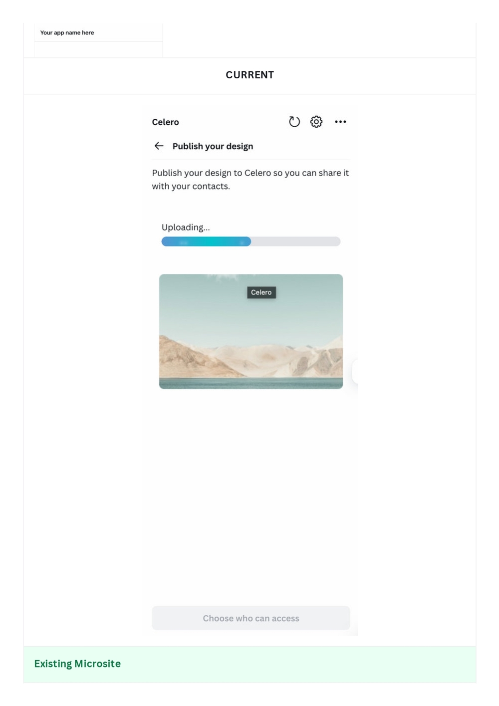
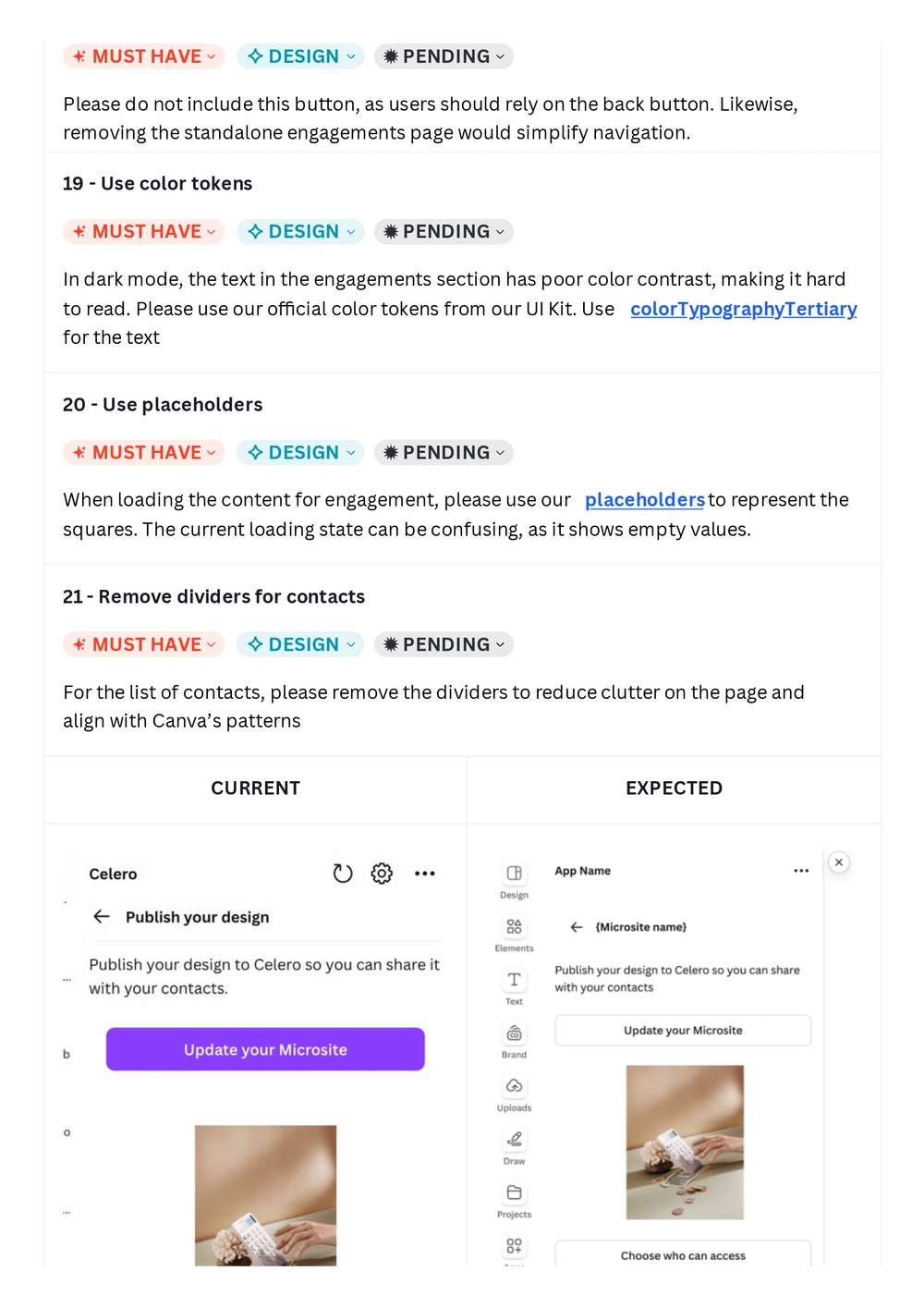
To prevent confusion with this page versus when a user is adding a new Microsite, use the name of the Microsite as the page name rather than "Publish your design."
14 - Remove divider
✦ MUST HAVE | ✧ DESIGN | ✹ PENDING
Please remove the divider below the surface page name by default to align with our Surface Header pattern.
Apply this to other screens in the app
15 - Stretch button
✦ MUST HAVE | ✧ DESIGN | ✹ PENDING
Stretch the Update button on the page while still adhering to the padding of the iframe.
16 - Use Secondary button
✦ MUST HAVE | ✧ DESIGN | ✹ PENDING
As mentioned in our guidelines, please do not use multiple primary buttons in a single space, as primary buttons should emphasize only a single action. Please make the two buttons Secondary buttons.
17 - Add engagement section
✦ MUST HAVE | ✧ DESIGN | ✹ PENDING
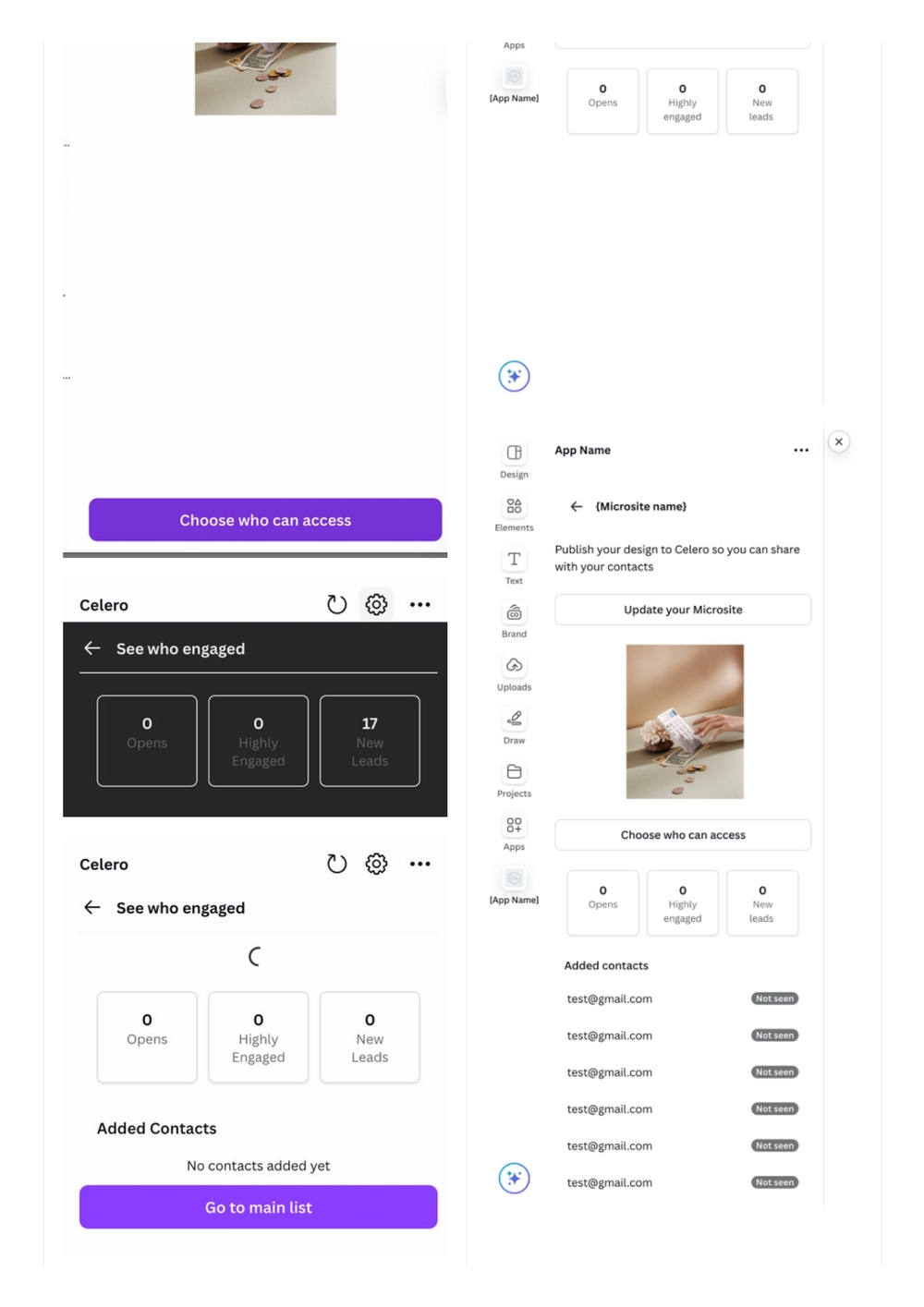
Seeing engagements is one of the core features of the app, as mentioned in its description. However, the engagements page requires users to navigate through three subpages before they can access this feature. Please display the engagements section on this page instead. Move the "Choose who can access" button below the image.
Note: If the user has not added any contacts, there is no need to show the "Added contacts" section.
18 - Remove "Go to main list" button
19 - Use color tokens
MUST HAVE | DESIGN | PENDING
In dark mode, the text in the engagements section has poor color contrast, making it hard to read. Please use our official color tokens from our UI Kit. Use colorTypographyTertiary for the text
20 - Use placeholders
MUST HAVE | DESIGN | PENDING
When loading the content for engagement, please use our placeholders to represent the squares. The current loading state can be confusing, as it shows empty values.
21 - Remove dividers for contacts
MUST HAVE | DESIGN | PENDING
For the list of contacts, please remove the dividers to reduce clutter on the page and align with Canva's patterns
CURRENT | EXPECTED
UI Comparison: Current vs Expected
Screenshots showing current and expected states of the Celero app panel within Canva, including:
- Microsite engagement stats (Opens, Highly Engaged, New Leads)
- Added Contacts section
- "See who engaged" view
- Loading state comparison
- Contact list with "Not seen" badges
Microsite - Updated
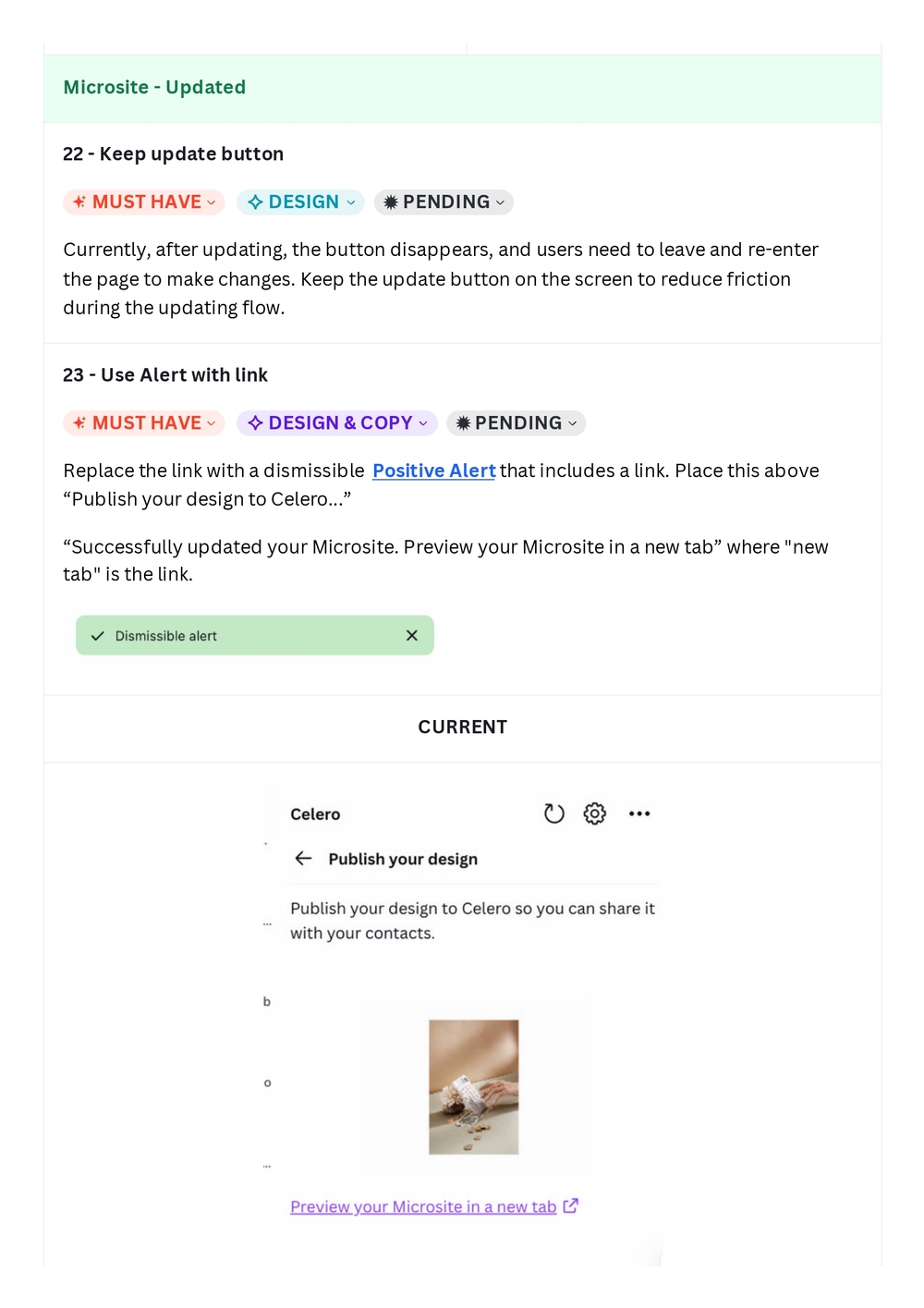
22 - Keep update button
MUST HAVE | DESIGN | PENDING
Currently, after updating, the button disappears, and users need to leave and re-enter the page to make changes. Keep the update button on the screen to reduce friction during the updating flow.
23 - Use Alert with link
MUST HAVE | DESIGN & COPY | PENDING
Replace the link with a dismissible Positive Alert that includes a link. Place this above "Publish your design to Celero..."
"Successfully updated your Microsite. Preview your Microsite in a new tab" where "new tab" is the link.
CURRENT
Change who can access, Share with contacts (Copy public link)
24 - Combine pages
MUST HAVE | DESIGN | PENDING
Please combine both the access and share with contacts pages, as both of these deal with privacy and sharing settings. Likewise, there is an abundance of space on the access page that can be utilized, allowing users to avoid switching and navigating between pages.
Please remove the bottom button navigating to other pages.
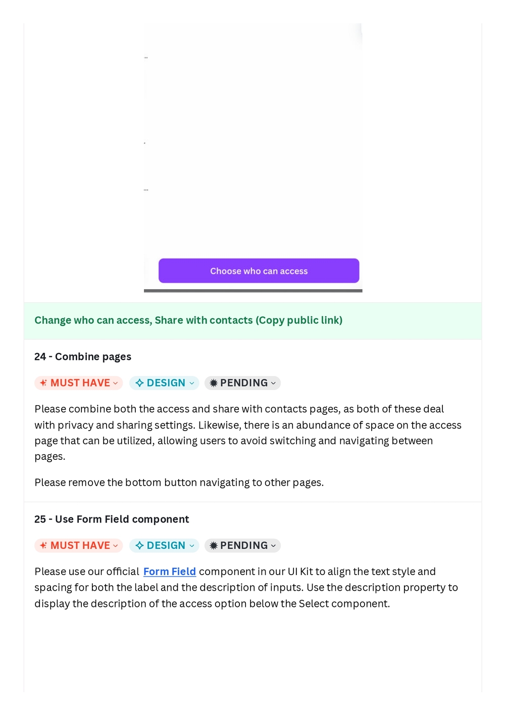
25 - Use Form Field component
MUST HAVE | DESIGN | PENDING
Please use our official Form Field component in our UI Kit to align the text style and spacing for both the label and the description of inputs. Use the description property to display the description of the access option below the Select component.
26 - Revise copy
MUST HAVE | COPY | PENDING
Some descriptions for the access options are lengthy and can make it difficult to read. Please simplify the descriptions so that users can easily understand them.
- Leads: "Generate more leads from your content. Visitors must enter their email to gain access. You'll be notified of new leads or have them added to your CRM automatically."
- Visitors: "Gain insights into content engagement. Visitors who haven't accepted cookies will be prompted to do so"
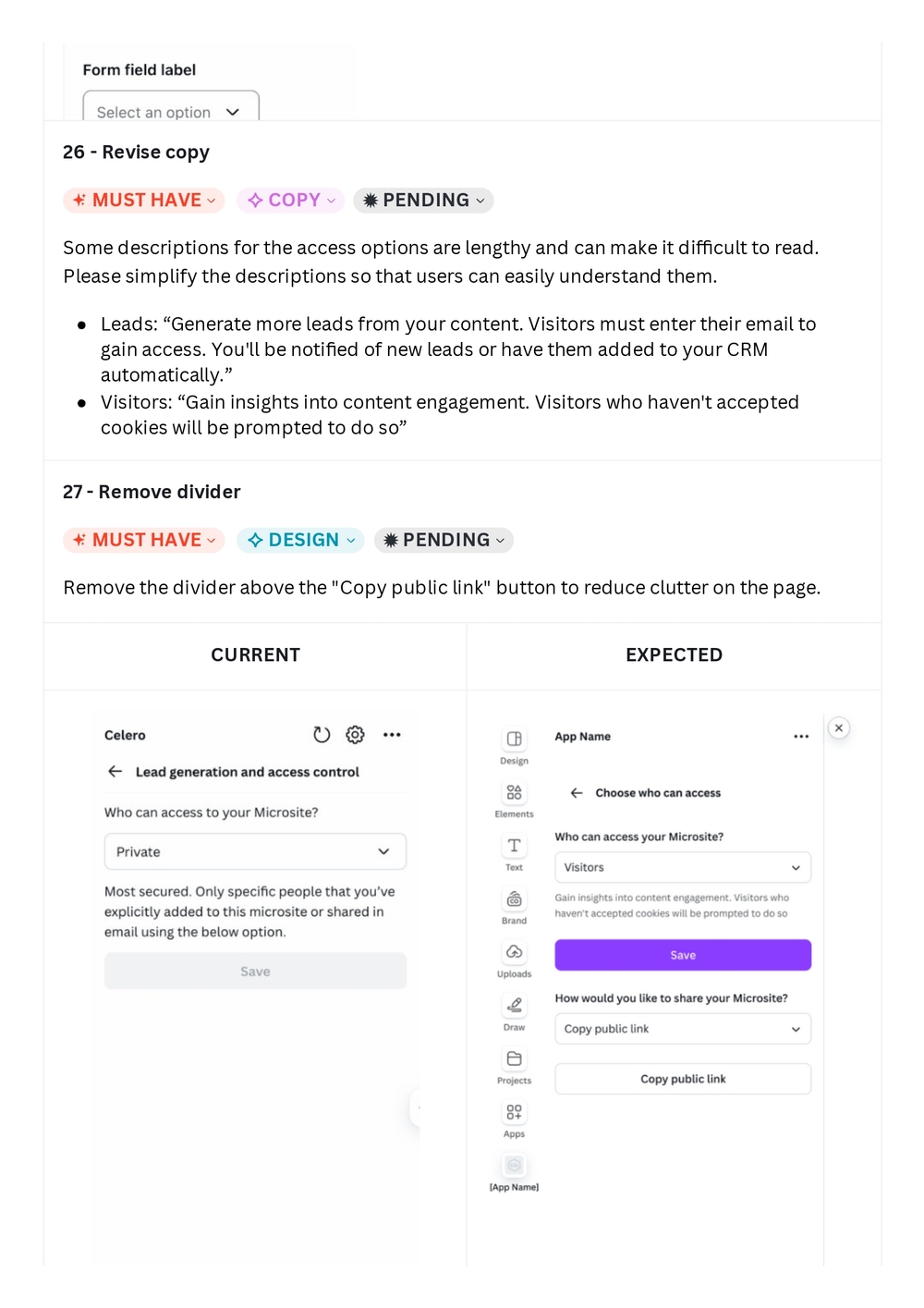
27 - Remove divider
MUST HAVE | DESIGN | PENDING
Remove the divider above the "Copy public link" button to reduce clutter on the page.
CURRENT | EXPECTED
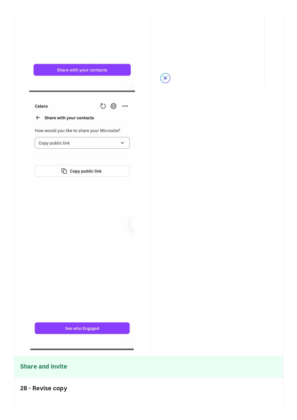
Share and invite
28 - Revise copy
UI screenshots showing:
- Current state: "Share with your contacts" page with "Copy public link" dropdown and "See who Engaged" button
- Expected state: Combined page with access controls and sharing options
28 - Revise copy (continued)
MUST HAVE | COPY | PENDING
Please make the label simple enough for the selection. Use "Share and invite via Celero".
29 - Use Form Field component
MUST HAVE | DESIGN | PENDING
Please use our official Form Field component in our UI Kit to align the text style and spacing for both the label and the description. Use the description property to display the description for the corresponding field input (e.g. "Enter the emails..." should describe the text input for emails only.)
Sample
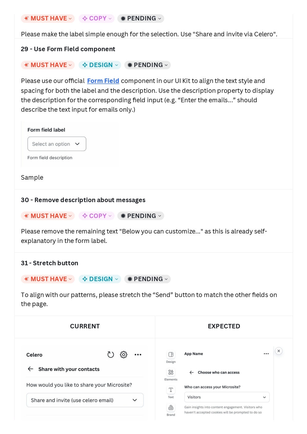
30 - Remove description about messages
MUST HAVE | COPY | PENDING
Please remove the remaining text "Below you can customize..." as this is already self-explanatory in the form label.
31 - Stretch button
MUST HAVE | DESIGN | PENDING
To align with our patterns, please stretch the "Send" button to match the other fields on the page.
CURRENT | EXPECTED
Get private link for each email
32 - Revise copy
MUST HAVE | COPY | PENDING
The current copy in the Select is lengthy and gets cut off in the component. Please simplify it to "Get private links for each email."
33 - Use Form Field component
MUST HAVE | DESIGN | PENDING
Please use our official Form Field component in our UI Kit to align the text style and spacing for both the label and the description. Use the description property to display the description for the corresponding field input (e.g. "Enter the emails..." should describe the text input for emails only.)
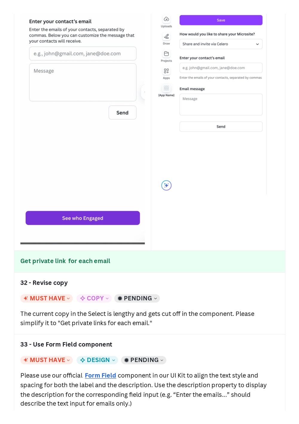
Sample
34 - Stretch button
MUST HAVE | DESIGN | PENDING
To align with our patterns, please stretch the "Add" button to match the other fields on the page.
35 - Remove Added contacts section when empty
MUST HAVE | DESIGN | PENDING
Please remove the Added contacts section when the user has not added any yet to reduce clutter on the page
36 - Remove dividers
MUST HAVE | DESIGN | PENDING
For the list of contacts, please remove the dividers to reduce clutter on the page and align with Canva's patterns
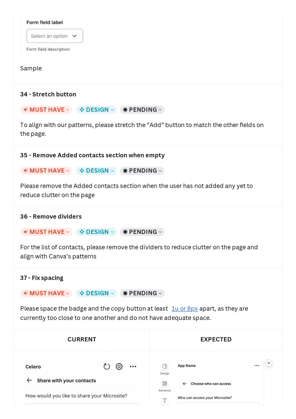
37 - Fix spacing
MUST HAVE | DESIGN | PENDING
Please space the badge and the copy button at least 1u or 8px apart, as they are currently too close to one another and do not have adequate space.
CURRENT | EXPECTED
Error
38 - Fix error
MUST HAVE | DESIGN & COPY | PENDING
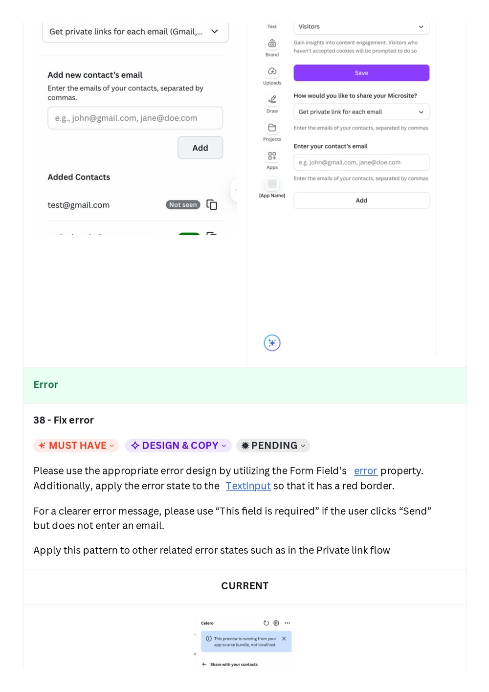
Please use the appropriate error design by utilizing the Form Field's error property. Additionally, apply the error state to the TextInput so that it has a red border.
For a clearer error message, please use "This field is required" if the user clicks "Send" but does not enter an email.
Apply this pattern to other related error states such as in the Private link flow
CURRENT
Empty state
39 - Use empty state pattern
✦ MUST HAVE ✧ DESIGN & COPY ✹ PENDING
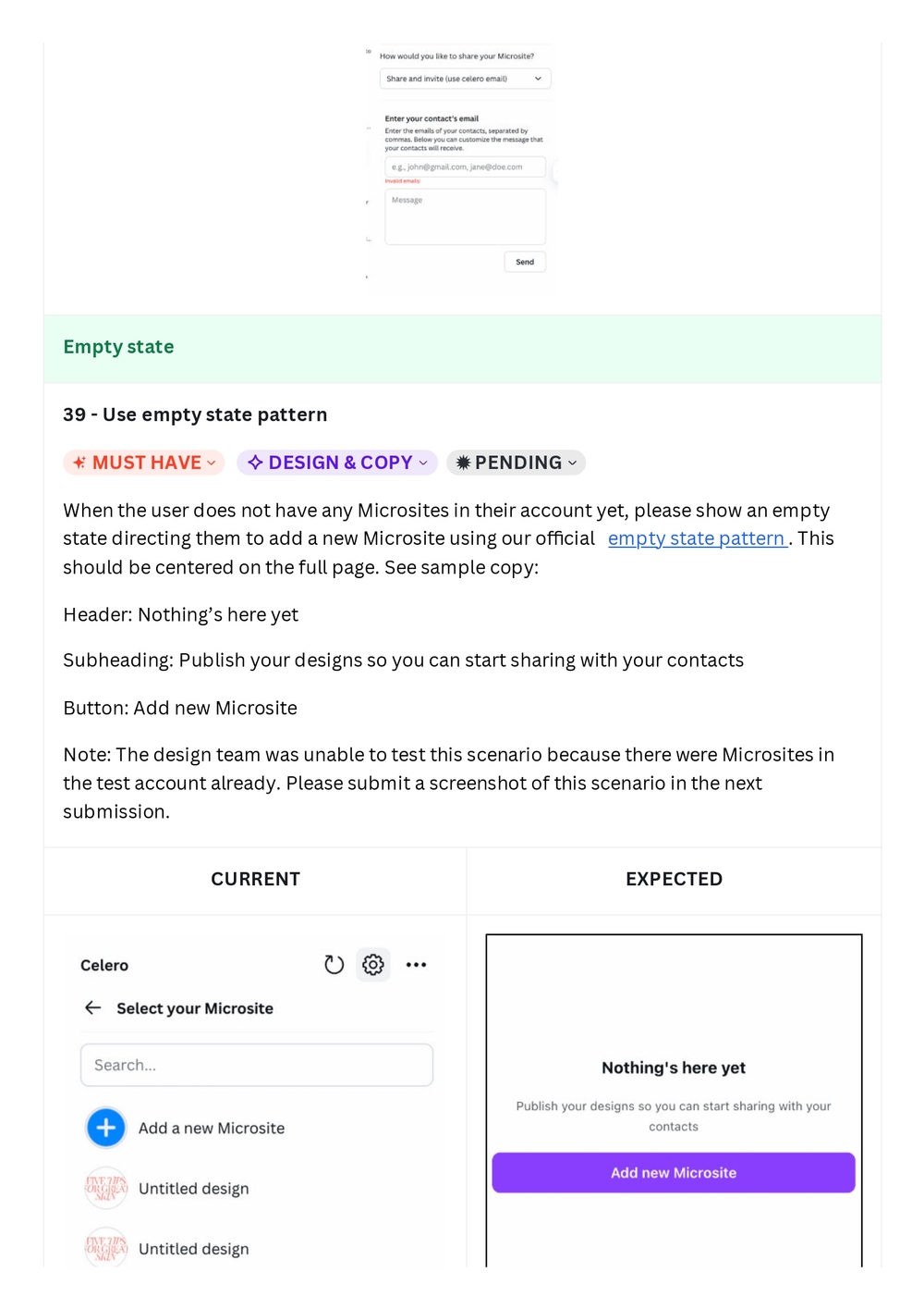
When the user does not have any Microsites in their account yet, please show an empty state directing them to add a new Microsite using our official empty state pattern. This should be centered on the full page. See sample copy:
Header: Nothing's here yet
Subheading: Publish your designs so you can start sharing with your contacts
Button: Add new Microsite
Note: The design team was unable to test this scenario because there were Microsites in the test account already. Please submit a screenshot of this scenario in the next submission.
App listing
40 - Revise copy
✦ MUST HAVE ✧ COPY ✹ PENDING
As mentioned in our guidelines, please do not end your short description and tagline with punctuation if they are single sentences. Please remove the exclamation point at the end.
41 - Revise images
✦ MUST HAVE ✧ DESIGN ✹ PENDING
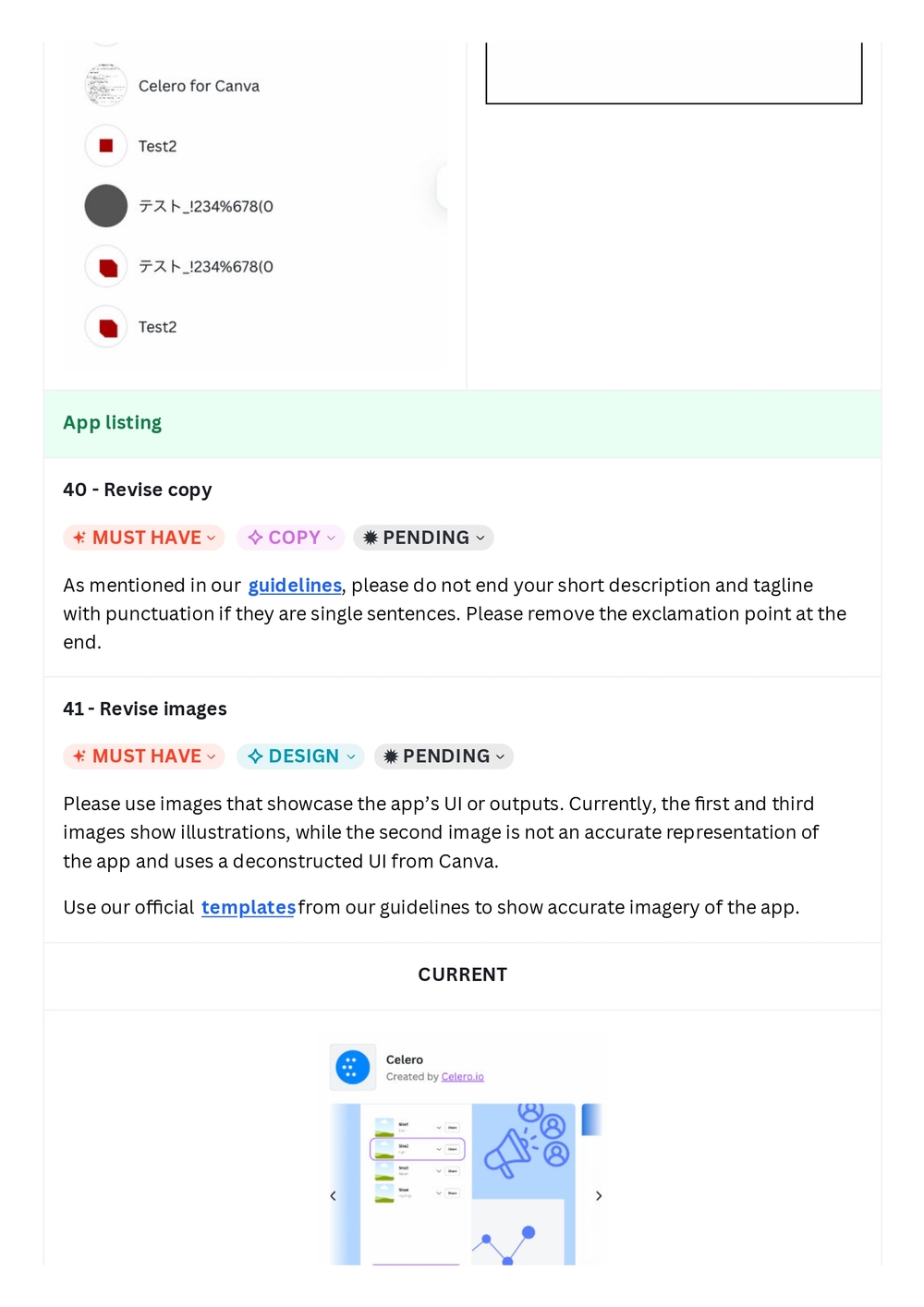
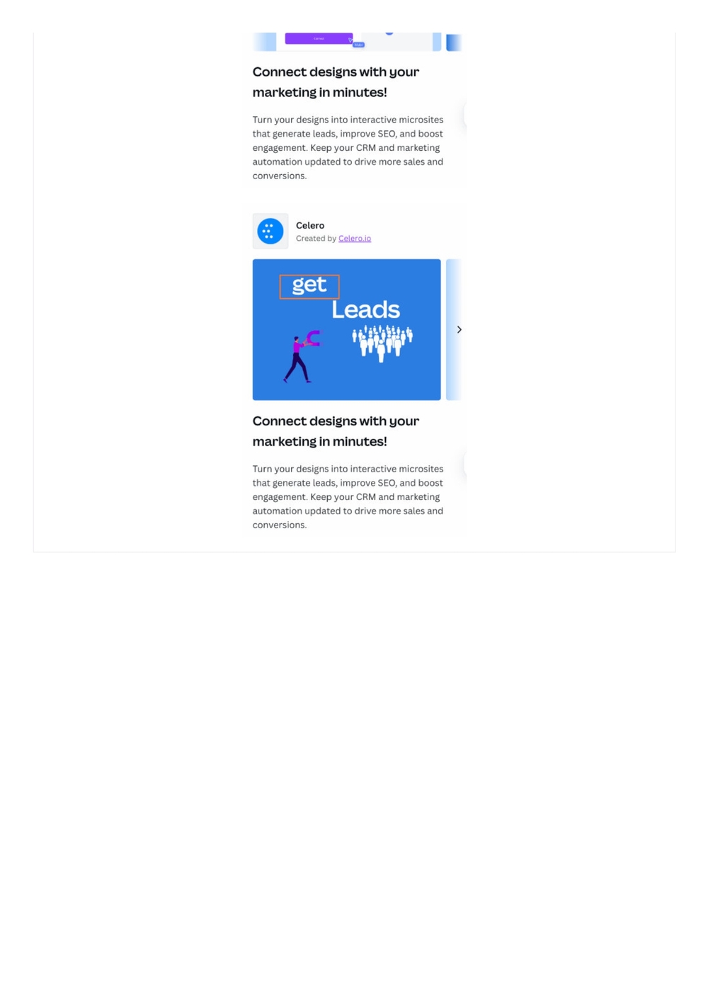
Please use images that showcase the app's UI or outputs. Currently, the first and third images show illustrations, while the second image is not an accurate representation of the app and uses a deconstructed UI from Canva.
Use our official templates from our guidelines to show accurate imagery of the app.
Connect designs with your marketing in minutes!
Turn your designs into interactive microsites that generate leads, improve SEO, and boost engagement. Keep your CRM and marketing automation updated to drive more sales and conversions.
Celero Created by Celero.io
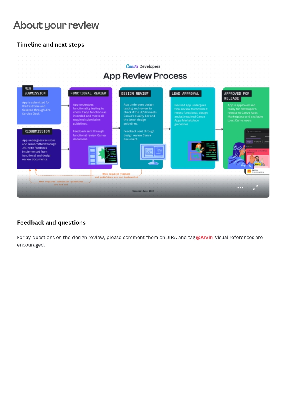
About your review
Timeline and next steps
Canva Developers — App Review Process
NEW SUBMISSION — App is submitted for the first time and ticketed through Jira Service Desk.
FUNCTIONAL REVIEW — App undergoes functionality testing to check if app functions as intended and meets all required submission guidelines. Feedback sent through functional review Canva document.
DESIGN REVIEW — App undergoes design testing and review to check if the UI/UX meets Canva's quality bar and the latest design guidelines. Feedback sent through design review Canva document.
LEAD APPROVAL — Revised app undergoes final review to confirm it meets functional, design, and all required Canva Apps Marketplace guidelines.
APPROVED FOR RELEASE — App is approved and ready for developer's release to Canva Apps Marketplace and available to all Canva users.
RESUBMISSION — App undergoes revisions and resubmitted through JSD with feedback implemented from functional and design review documents.
Feedback and questions
For any questions on the design review, please comment them on JIRA and tag @Arvin. Visual references are encouraged.